
PROJECT OVERVIEW
A mobile app that helps students discover real-time campus events, explore the campus atmosphere, and connect with peers through mood-and goal-based interactions.
Problem:
Students often miss campus events or struggle to know what’s happening in real time. Flyers, emails, and the RMIT app exist, but these resources make it hard to discover events or connect with others. Many students, especially international students, feel a lack of belonging and miss opportunities to engage socially.
Solution:
ConnectNow is a campus social mobile app that helps students discover real-time events that match their mood and goals. Students can quickly find and join events happening right now or create their own events to suit their preferences. The app also displays events on a map, showing locations and peers’ moods across campus. By making it easy to find relevant activities and connect with others, ConnectNow encourages students to engage with campus life and feel socially connected in real time.
Goal:
Encourage students to engage with campus life, find events aligned with their interests, and feel socially connected in real time.
Project type: UX/UI
My role: UX/UI designer
Project duration: Aug 2025 to Oct 2025
Tools used:
Figma, Photoshop
UNDERSTANDING THE USER
User Research
Through student interviews, I was able to understand user needs more deeply. Students want to socialise and enjoy uni life, but channels like flyers and emails make events feel disorganised and easy to miss. Although there’s an RMIT app, it serves other purposes and doesn’t encourage socialising among peers.
While there are existing RMIT clubs, some students prefer creating their own casual social events, even something small like a coffee chat. Others want to join smaller, more relaxed groups instead of large, high-energy events. Many students also mentioned feeling disconnected or isolated, especially international students.

Persona
Sarah finds it hard to know what’s happening on campus in real time. She needs a simple and engaging way to discover and join events that match her interests and mood, helping her feel more connected to university life.

STARTING THE DESIGN
User Flow
I created three key user flows to focus on the core experiences of the Campus Social app. Flow 1 covers discovering and joining events, addressing the main user need of quickly finding activities that match their mood and interests. Flow 2 shows creating an event, supporting students who want to organise small, casual gatherings. Flow 3 demonstrates exploring events on the map, giving students a visual way to see real-time moods and event locations across campus. These flows show how the app helps students easily find and join campus events and connect with others.

Sitemap
The main user needs were discovering real-time events that match their interests and connecting with others. The user flows reflect these needs, and the sitemap was created based on the flows. It helped ensure the app has a logical hierarchy and that no important screens or features were missing.

Paper Wireframes
I sketched paper wireframes for each screen, guided by the user pain points and flows. The goal was to quickly explore multiple layout variations, test ideas, and find the most intuitive experience for students.


Mid-fidelity Prototype
I created a mid-fidelity prototype in Figma to test how easily students could navigate the app and discover events. At this stage, I focused on layout, flow, and functionality rather than visuals. I received feedback from students on the layout, navigation, and clarity of information, which helped me identify areas for improvement before developing the high-fidelity prototype.

Visual Design System
Before moving on to the high-fidelity prototype, I built a visual design system to keep a consistent look and feel. It includes typography, colour palette, and key UI elements such as buttons, icons, and chips, which helped me create a cohesive experience as I refined the prototype. I also designed a logo for ConnectNow to reflect the app’s goal of connecting students, while conveying a friendly and engaging vibe. The letters “C” and “N” are combined to symbolise connection and engagement.

REFINING THE DESIGN
User Testing & Refinements
I conducted usability testing with five students to see how easily they could navigate the prototype and understand event information. The feedback revealed several areas to improve, which I addressed by refining layouts, adding goal chips and filters, updating event cards, and improving the map and wheel interactions. These changes made the app clearer, easier to use, and more intuitive.
.png)
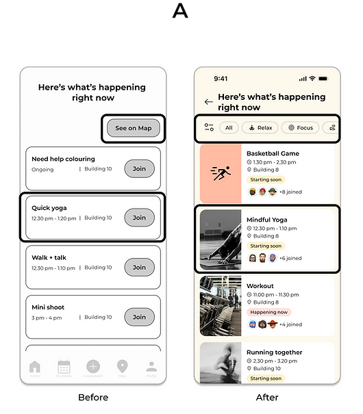
A - Event Results
Based on user feedback, I simplified this page to help students focus on events by their goals, adding goal chips and filters to allow quick navigation. Event cards now include a thumbnail image, joined count, and status to help users understand event details at a glance.
B - Events Map
Users couldn’t tell which pins represented different goals, as they all looked the same. To address this, I gave each goal a distinct icon and colour, making pins quickly recognisable at a glance.
.png)
.png)
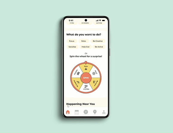
C - Home
Feedback showed that the wheel didn’t feel connected to the “What do you want to do?” section. To improve clarity, I grouped related elements and added goal icons to the wheel, allowing users to understand each option at a glance without relying on text alone.


High-Fidelity Prototype
The high-fidelity prototype follows the original user flow and includes all refinements based on student feedback. It focuses on solving key pain points by making it easier for students to discover events, find activities that match their interests, and connect with others on campus in real time.
.png)
Home Screen
Students choose how they feel and what they want to do, and the app recommends events that match. For those who want a little adventure, the “spin the wheel” feature offers a fun, random goal to spark new experiences.
Event Results Screen
Students can see the number of people who have joined each event and its real-time status (Happening Now, Starting Soon, Ongoing). This solves the problem of missing events by giving students immediate insight into what’s active at the moment and encouraging quick decisions to join in.
.png)
Map
Students can switch between two segmented modes:

Events Mode
Shows all current campus events, their locations, and filters for specific goals via chips. This helps students visually understand what’s happening nearby so they can easily navigate and participate.

Mood Mode
Displays how peers across campus are feeling right now, helping students feel more connected.
TAKEAWAYS
University students found the design much more engaging and clearer after refinements, with better visual hierarchy. This project started with conversations with my peers, who shared that they want to meet new people at university but often don’t know how, leading to a sense of disconnection. Talking to real users helped me gain valuable insights and shaped the direction of the app. I also learned how much feedback and iteration can improve a design. I could see the app becoming more intuitive and meaningful with each round of testing.
I’d like to develop additional features such as “My Events” and “Profile,” and conduct another round of user testing. I also want to explore new ways for students to interact within the app, such as sharing reactions or short messages on the map, to strengthen the sense of connection that supports the app’s main goal. I also want to make the app more accessible for all users.